Subway Pulse
iOS Beta
A subway tracker that's actually beautiful to look at and useful the moment you open it.
Join the TestFlight beta →Subway Pulse shows you where your train is on a map that is clean, fast, and beautiful. It’s designed to be an eye-pleasing infographic art piece that’s also a useful tool for your daily commute, or for exploring New York City by subway.
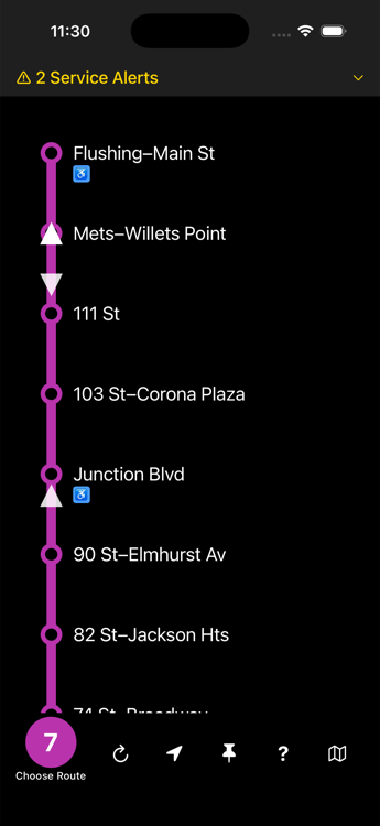
A live diagram unlike anything else out there
At its center is a live line diagram: train positions are simulated in real time along the actual track, moving between stations as their arrival data updates. You can see at a glance whether your train is two stops away or crawling. No refreshing, no guessing.
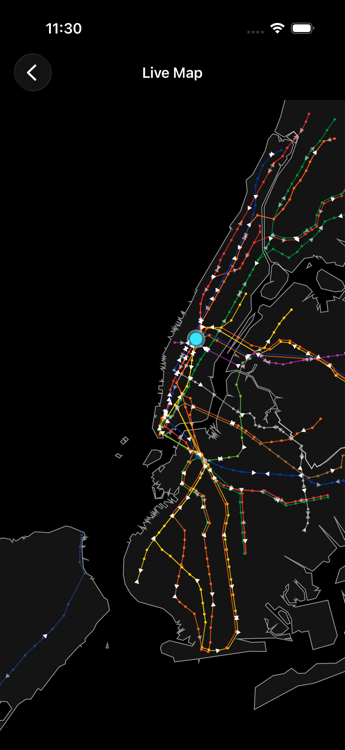
Zoom out, and it gets even better
The full system map renders the geography of New York City, with every train currently running across the entire subway — all lines, all boroughs — simulated in real time along the track. Watch the city breathe as trains from every line move across the five boroughs at once. It’s the entire New York City subway system in your pocket.
Not just an art piece
Subway Pulse puts useful information in your hand exactly when you need it.
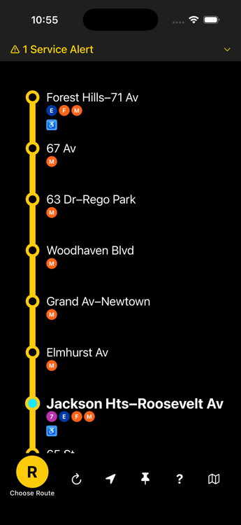
Watch your ride, live
Follow your train along the subway map with the current station highlighted. Never wonder what stop you’re at again.
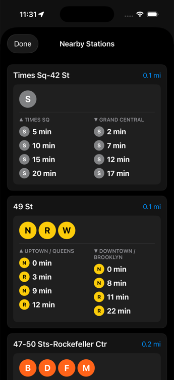
Nearby, in one tap
Find the closest stations to you and their next arrivals immediately.
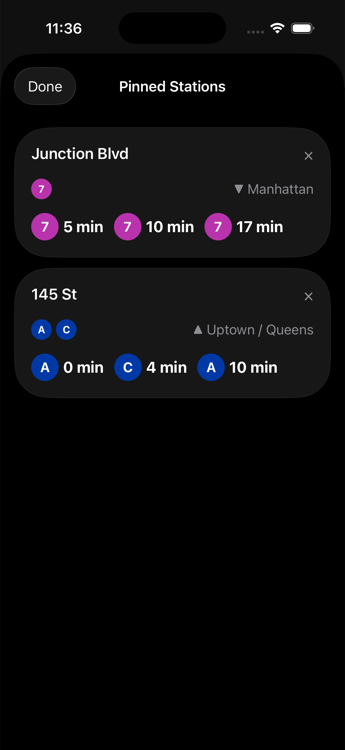
Your regulars, pinned
The platform you catch every morning, the transfer you always make — in one glanceable list, never more than a tap away.
Widgets on your home screen
Add widgets for immediate access to pinned stations and nearby arrivals, no need to open the app.
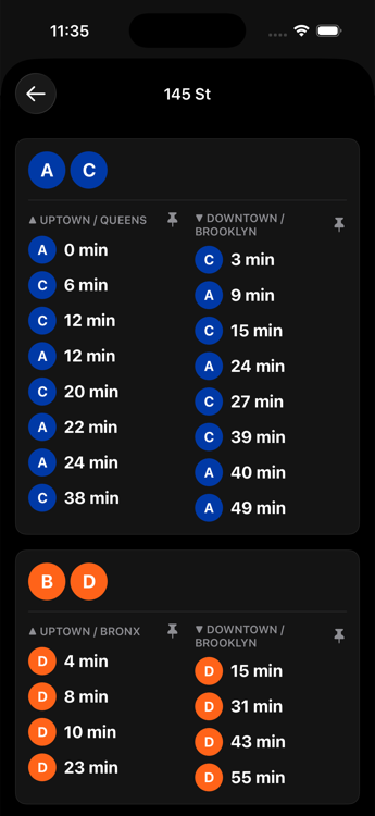
Every transfer, together
Tap any station for a clean, focused arrival board — one more tap shows every transfer’s arrivals together.
Every detail, considered
Official colors, accessibility station icons, clear service alerts, and a system built to bring a little zen to your commute.
We’d love your feedback
Especially on the live maps — and anything you see that seems inaccurate or could be improved. Use the in-app Help button to send thoughts directly to the developer.
More features are planned, including interesting facts about each station’s history and art.
Ready to ride?
Spots are limited to 100 testers. Grab yours and help shape Subway Pulse.
Join the TestFlight beta →